Have you ever been in a Facebook group or emailing your formatter when they casually drop terms like “trim size,” “bleed,” or “widows,” and you just sit there blinking at your screen, wondering if you missed an entire course on publishing jargon?
You’re not alone.
Because here’s the deal: every industry has its own lingo, and publishing is no different. Writers spend years learning about character arcs and three-act structures, but when it comes to book formatting? It can feel like a whole new language.
Let’s change that. Welcome to Formatting Lingo 101!
1. Trim Size (No, It’s Not About Haircuts)
Trim size is the physical size of your printed book. It’s measured in inches (in the U.S.) and it’s one of the very first decisions you need to make before formatting your print book.
Common trim sizes include:
- 5″ x 8″ – Great for small paperbacks, especially fiction
- 5.5″ x 8.5″ – A slightly roomier version
- 6″ x 9″ – Often used for nonfiction and trade paperbacks
Each trim size gives your book a different feel, and it can even impact page count and printing costs. Want a deep dive on choosing the right one? You can read my blog post about that topic HERE.
👉 Why it matters: Your trim size determines how your book fits on shelves, what readers expect, and how your interior layout looks. Choose this before formatting anything.
2. Bleed (Not As Scary As It Sounds)
Despite the dramatic name, bleed has nothing to do with injuries. In publishing, bleed refers to the extra space around images or colored backgrounds that extends beyond the trim size.
If you’re printing an image that goes all the way to the edge of the page, you need bleed to make sure the printer doesn’t leave a white border. Most formatting programs will ask you if your file has bleed, and it affects how your PDF is exported.
👉 Why it matters: If you’re including full-page images or design elements that reach the edge, always account for bleed in your design and formatting files.
3. Margins (The Quiet MVPs)
Margins are the blank spaces around your text. In digital formatting, they make your book readable. In print, they’re even more important—especially the inner margin (also called the gutter) that runs down the center when you open the book.
You want enough space so your text isn’t swallowed by the spine.
👉 Why it matters: Too-small margins make your book hard to read and may get your file rejected by distributors like KDP or IngramSpark.
4. Front Matter and Back Matter (The Bookends of Your Book)
These might sound familiar, especially if you’ve read my previous blog posts on front and back matter, but they’re worth repeating.
- Front Matter: Everything that comes before Chapter One—title page, copyright, dedication, table of contents, etc.
- Back Matter: Everything after “The End”—about the author, acknowledgments, teaser for the next book, and links to your other work.
👉 Why it matters: These sections set the tone (and future sales potential) of your book.
5. Headers, aka Running Heads
Headers (sometimes called running heads) are the small lines of text at the top of each page. They usually contain the book title, author name, or chapter title.
In fiction, it’s often:
- Odd pages: Author Name
- Even pages: Book Title
In nonfiction, you might use chapter titles instead to help readers navigate.
👉 Why it matters: Headers create a polished, professional look and improve usability—especially for nonfiction readers who jump around.
6. Widows and Orphans (Don’t Worry, We’re Still Talking About Books)
In publishing lingo:
- A widow is a single word or very short line at the end of a paragraph that appears at the top of a new page.
- An orphan is a similar lonely bit of text left stranded at the bottom of a page.
It’s visually awkward and disrupts the reading flow. Formatting software can sometimes automatically fix these, but you’ll want to check your layout manually, especially in print.
👉 Why it matters: Leaving a single word dangling on a new page just looks… off. It’s a small detail that makes a big difference in professionalism.
7. Embedded Fonts
If you want your book to use a specific font—especially a custom one—you’ll need to make sure it’s an embedded font.
Embedded means the font is included in your exported file so that it displays correctly across devices and when printed. Some free fonts (like Google Fonts) are embeddable. Others, especially ones you purchase, may have licensing restrictions.
Formatting software like Atticus, Vellum, and even Canva often include licensed fonts you can safely use. But if you’re uploading your own, double-check that it’s embeddable.
👉 Why it matters: Without embedding, your fancy fonts might not show up correctly on an eReader—or worse, get your file rejected by retailers.
8. File Formats (EPUB, PDF, and Goodbye, MOBI)
Different file formats serve different purposes:
- EPUB: The standard format for eBooks. Used by most retailers including Apple, Kobo, and Barnes & Noble.
- PDF: Required for print files like paperbacks and hardcovers. It preserves layout exactly.
- MOBI: Used to be Amazon’s format, but is being phased out. Most of the time now, Amazon accepts EPUB files too.
👉 Why it matters: Always check which file type your publishing platform requires. Formatting for print vs. eBook is not the same.
9. Ask the Questions (Seriously, We Don’t Mind!)
One last, very important term: Ask.
Okay, not a formatting term, but hear me out.
If your formatter or publishing software throws out a word or phrase you don’t know, ask. There are no dumb questions here. Every formatter—myself included—has gotten so used to this vocabulary that we sometimes forget not everyone lives in formatting land.
So whether you’re DIY-ing your book interior or hiring a pro, speak up. Ask what a term means. Google it. Or hey, drop a comment or DM me and I’ll explain.
👉 Why it matters: Your book. Your name on the cover. You deserve to understand what’s happening during every step of the publishing process.
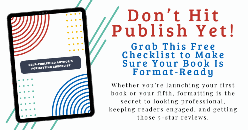
Feeling overwhelmed? No worries—I’ve got a free formatting checklist just for you! This guide walks you through everything from front matter to final file formats, and it’s perfect whether you’re doing it yourself or working with a formatter.
👉 Download the Formatting Checklist Here
Final Thoughts: You’ve Got This
Book formatting lingo might feel intimidating at first, but once you understand a few key terms, it becomes much easier to communicate with your formatter, pick the right software, and feel in control of your publishing process.
And remember: You don’t have to learn it all at once. Bookmark this post. Save it for later. Come back to it every time you need a quick refresher.
Got questions? Drop them in the comments or send me a message—I’ll answer directly or maybe even turn your question into a future video or blog post.
Happy formatting—and even happier writing!