Jennifer Gregson

Young Adult Indie Author

Menu
  • Home
Menu

Blog

How to Use Headings and Flourishes in Book Formatting: A Fun Guide for Indie Authors

Posted on July 25, 2025 by Jennifer Gregson

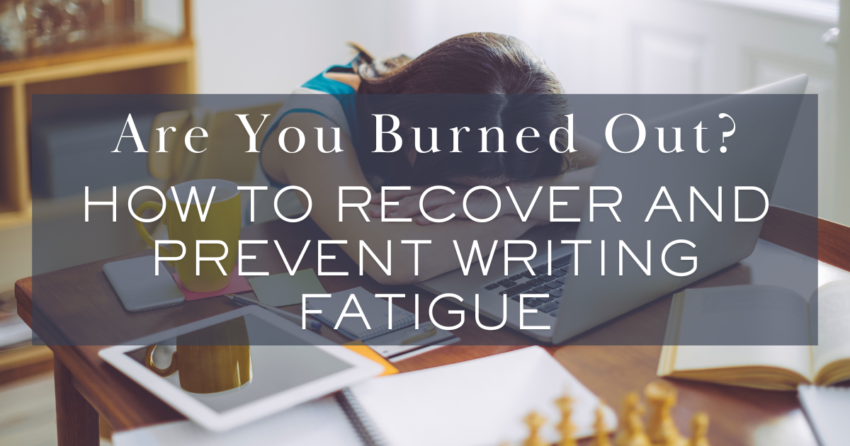
Let’s talk about the little things—the stylish, quirky, and sometimes-overlooked details that can take your self-published book from “meh” to “WOW.”

Think of them as the accessories of your book’s wardrobe. They may not be the main outfit (your story, obviously), but when chosen well, they tie everything together and leave your readers thoroughly impressed.

Why Formatting Even Matters (Let’s Start There)

Before we get all swirly with flourishes, let’s talk about why formatting is a big deal.

Good formatting:

  • Makes your book easier to read (hello, reader retention)
  • Enhances tone and mood
  • Helps convey genre visually
  • Shows professionalism—and let’s be honest, indie authors are crushing it in that department lately!

We’ve come a long way from the days when self-publishing was side-eyed. Nowadays, readers often can’t tell the difference between a beautifully formatted indie book and one from a Big 5 publisher—and that’s amazing. The more polished your book looks, the more seriously you’ll be taken.

So let’s raise the bar (and have a little fun while we’re at it).

Chapter Headings: The First Impression on Every Page

Your chapter headings are the visual anchor of your storytelling flow. They’re often the first thing a reader sees when flipping to a new section. Here’s what you want to consider when setting them up:

1. Font Choices and Genre Vibes

The font you choose should match your genre and tone. Here are a few quick ideas:

GenreHeading Font Idea
Romantic ComedyScript or handwritten fonts
FantasyElegant serif fonts or whimsical styles
Sci-FiTech-inspired, minimalist fonts
Contemporary YAClean sans serif fonts
HorrorGothic or sharp-edged serif fonts

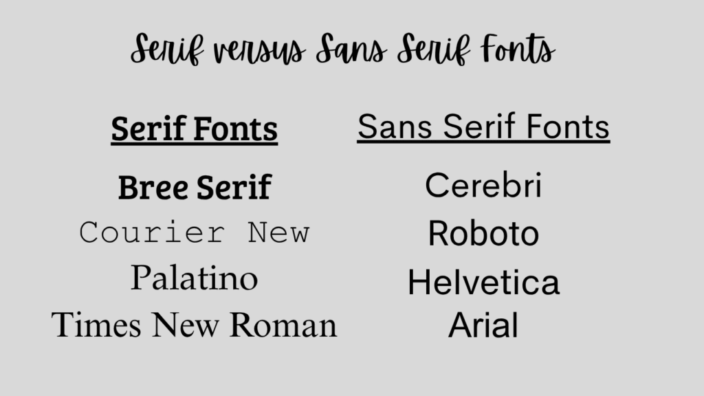
✍️ Pro Tip: A serif font has those little lines or feet on each letter (like a typewriter). A sans serif font is smoother and more modern (think Helvetica).

Most formatting tools like Vellum offer great options and a preview panel to test different looks. Just remember: be consistent throughout your book. No switching fonts halfway through!

Heading Placement and Layout

Once you’ve nailed down your font, you’ll need to decide how and where your headings live on the page:

  • Centered or Left-Aligned?
    Centered is classic and clean. Left-aligned can feel more modern and edgy.
  • Chapter Numbering Style
    Do you want “Chapter One,” “1,” or something quirky like “Act I: The Fall”? You get to decide!
  • Chapter Titles or POV Labels?
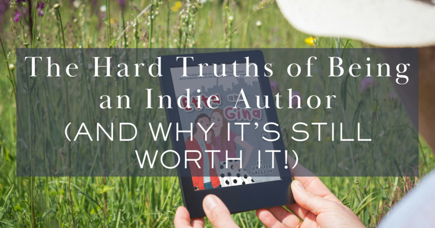
    If you’re writing a dual POV book (like Etta and Gina, which alternates perspectives), consider labeling chapters with the character’s name:
    → Chapter 3 – Etta
    → Chapter 4 – Gina

This helps your reader stay grounded, especially in romance or multi-character narratives.

Subheadings in Nonfiction? We Got You.

If you’re formatting nonfiction, subheadings are your best friend.

They:

  • Make your book skimmable
  • Guide the reader through complex ideas
  • Break up long walls of text

Use a style hierarchy like:

  • Heading 1: Chapter Title
  • Heading 2: Main Topic
  • Heading 3: Sub-topic

📋 Formatting Tip: Create a simple style sheet for yourself! Even if it’s just a Post-it or Notes app memo, jot down your font choices, heading sizes, and spacing. This will help keep things consistent—especially helpful if you’re formatting in Word or Google Docs.

Let’s Talk Flourishes (aka the Fun Stuff!)

Now for the sparkly part—flourishes! These are the visual decorations that make your print book stand out. Think of them as confetti sprinkled on the pages (just, you know, tastefully).

1. Scene Breaks

You know when your chapter has a time jump, POV switch, or location change? You don’t always need a full chapter break. Enter: the scene break!

Instead of using a boring row of asterisks, you can insert:

  • A cute swirl design
  • Stars ✨
  • A custom Canva-made image (like a vine, a spiral, or a moon phase)

Formatting programs like Vellum usually offer several built-in options, or let you upload your own custom flourish. Just make sure your image is sized correctly (they’ll tell you the specs).

2. Chapter Openers

Another place for a flourish? The beginning of your chapters!

You can:

  • Add a horizontal line or graphic under the chapter title
  • Use large drop caps or stylized first letters (e.g., “The quick brown fox…”)
  • Highlight the first few words in bold or caps for drama

Just keep in mind that some of these effects don’t always translate to eBooks. Flourishes are generally best appreciated in print format, so if you’re releasing both, test both layouts.

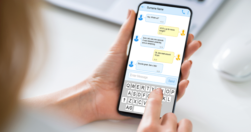
3. Text Messages in Modern Fiction

This one’s a little bonus tip! If your modern-day novel includes text messages, you’ve got some formatting choices to make.

You can:

  • Format them like regular dialogue with “she texted” tags
  • Use italics to differentiate them
  • Create actual text message bubbles (some formatting tools allow this!)
  • Use bold headers like:
    SOPHIE: hey are you coming over or nah?

The goal? Clarity and consistency. Whatever style you choose, stick with it so your readers don’t get confused.

Keep It Professional—but Playful

Here’s your guiding principle with headings and flourishes: subtle flair, not visual chaos.

Sprinkles of style are delightful. A full cupcake shop explosion? Not so much.

If you use flourishes on every single page, it might distract from your story. Instead, treat them like spices in a recipe—just enough to enhance flavor, not overpower it.

Style Sheet Reminder 📝

Create a style sheet—even if you’re using pro software like Vellum or Atticus.

Include:

  • Paragraph font
  • Heading font
  • Chapter heading alignment
  • Subheading sizes
  • Flourish choices (for scene breaks, chapter openers, etc.)
  • Any design elements you plan to use in print or eBook versions

This is your visual blueprint, and it makes revisions and consistency so much easier.

Final Thoughts: Formatting Is Your Book’s Vibe Check

Formatting isn’t just about margins and line spacing—it’s part of your reader’s experience.

It gives your book visual personality. It helps communicate your genre and tone before your reader even dives into the prose. And it shows that you, the author, took the time to create a professional, enjoyable product.

Even if you’re not a “design” person, headings and flourishes let you express creativity beyond the words. And the best part? You get to decide what fits your book.

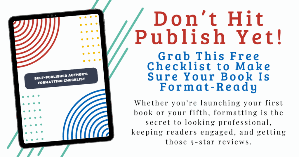
Free Formatting Checklist 🎁

If this all feels a little overwhelming, I’ve got your back. Grab my free formatting checklist—it walks you through everything from front matter to font choices to finishing touches like… yep, headings and flourishes.

👉 Download the Free Formatting Checklist Here

Grab your free Indie Author Formatting Checklist here

Got Questions? Let’s Chat!

Drop your formatting questions in the comments—or message me if you’re stuck on fonts, flourishes, or first-page freakouts. I might even turn your question into a full video or blog post!

Happy formatting, and even happier writing!

book formatting terms for self-publishing authors

Book Formatting Terms Every Indie Author Should Know: Lingo 101 for Self-Publishing

Posted on July 18, 2025July 18, 2025 by Jennifer Gregson

Have you ever been in a Facebook group or emailing your formatter when they casually drop terms like “trim size,” “bleed,” or “widows,” and you just sit there blinking at your screen, wondering if you missed an entire course on publishing jargon?

You’re not alone.

Because here’s the deal: every industry has its own lingo, and publishing is no different. Writers spend years learning about character arcs and three-act structures, but when it comes to book formatting? It can feel like a whole new language.

Let’s change that. Welcome to Formatting Lingo 101!

1. Trim Size (No, It’s Not About Haircuts)

Trim size is the physical size of your printed book. It’s measured in inches (in the U.S.) and it’s one of the very first decisions you need to make before formatting your print book.

Common trim sizes include:

  • 5″ x 8″ – Great for small paperbacks, especially fiction
  • 5.5″ x 8.5″ – A slightly roomier version
  • 6″ x 9″ – Often used for nonfiction and trade paperbacks

Each trim size gives your book a different feel, and it can even impact page count and printing costs. Want a deep dive on choosing the right one? You can read my blog post about that topic HERE.

👉 Why it matters: Your trim size determines how your book fits on shelves, what readers expect, and how your interior layout looks. Choose this before formatting anything.

2. Bleed (Not As Scary As It Sounds)

Despite the dramatic name, bleed has nothing to do with injuries. In publishing, bleed refers to the extra space around images or colored backgrounds that extends beyond the trim size.

If you’re printing an image that goes all the way to the edge of the page, you need bleed to make sure the printer doesn’t leave a white border. Most formatting programs will ask you if your file has bleed, and it affects how your PDF is exported.

👉 Why it matters: If you’re including full-page images or design elements that reach the edge, always account for bleed in your design and formatting files.

3. Margins (The Quiet MVPs)

Margins are the blank spaces around your text. In digital formatting, they make your book readable. In print, they’re even more important—especially the inner margin (also called the gutter) that runs down the center when you open the book.

You want enough space so your text isn’t swallowed by the spine.

👉 Why it matters: Too-small margins make your book hard to read and may get your file rejected by distributors like KDP or IngramSpark.

4. Front Matter and Back Matter (The Bookends of Your Book)

These might sound familiar, especially if you’ve read my previous blog posts on front and back matter, but they’re worth repeating.

  • Front Matter: Everything that comes before Chapter One—title page, copyright, dedication, table of contents, etc.
  • Back Matter: Everything after “The End”—about the author, acknowledgments, teaser for the next book, and links to your other work.

👉 Why it matters: These sections set the tone (and future sales potential) of your book.

5. Headers, aka Running Heads

Headers (sometimes called running heads) are the small lines of text at the top of each page. They usually contain the book title, author name, or chapter title.

In fiction, it’s often:

  • Odd pages: Author Name
  • Even pages: Book Title

In nonfiction, you might use chapter titles instead to help readers navigate.

👉 Why it matters: Headers create a polished, professional look and improve usability—especially for nonfiction readers who jump around.

6. Widows and Orphans (Don’t Worry, We’re Still Talking About Books)

In publishing lingo:

  • A widow is a single word or very short line at the end of a paragraph that appears at the top of a new page.
  • An orphan is a similar lonely bit of text left stranded at the bottom of a page.

It’s visually awkward and disrupts the reading flow. Formatting software can sometimes automatically fix these, but you’ll want to check your layout manually, especially in print.

👉 Why it matters: Leaving a single word dangling on a new page just looks… off. It’s a small detail that makes a big difference in professionalism.

7. Embedded Fonts

If you want your book to use a specific font—especially a custom one—you’ll need to make sure it’s an embedded font.

Embedded means the font is included in your exported file so that it displays correctly across devices and when printed. Some free fonts (like Google Fonts) are embeddable. Others, especially ones you purchase, may have licensing restrictions.

Formatting software like Atticus, Vellum, and even Canva often include licensed fonts you can safely use. But if you’re uploading your own, double-check that it’s embeddable.

👉 Why it matters: Without embedding, your fancy fonts might not show up correctly on an eReader—or worse, get your file rejected by retailers.

8. File Formats (EPUB, PDF, and Goodbye, MOBI)

Different file formats serve different purposes:

  • EPUB: The standard format for eBooks. Used by most retailers including Apple, Kobo, and Barnes & Noble.
  • PDF: Required for print files like paperbacks and hardcovers. It preserves layout exactly.
  • MOBI: Used to be Amazon’s format, but is being phased out. Most of the time now, Amazon accepts EPUB files too.

👉 Why it matters: Always check which file type your publishing platform requires. Formatting for print vs. eBook is not the same.

9. Ask the Questions (Seriously, We Don’t Mind!)

One last, very important term: Ask.

Okay, not a formatting term, but hear me out.

If your formatter or publishing software throws out a word or phrase you don’t know, ask. There are no dumb questions here. Every formatter—myself included—has gotten so used to this vocabulary that we sometimes forget not everyone lives in formatting land.

So whether you’re DIY-ing your book interior or hiring a pro, speak up. Ask what a term means. Google it. Or hey, drop a comment or DM me and I’ll explain.

👉 Why it matters: Your book. Your name on the cover. You deserve to understand what’s happening during every step of the publishing process.


Feeling overwhelmed? No worries—I’ve got a free formatting checklist just for you! This guide walks you through everything from front matter to final file formats, and it’s perfect whether you’re doing it yourself or working with a formatter.

👉 Download the Formatting Checklist Here

Grab your free Indie Author Formatting Checklist here

Final Thoughts: You’ve Got This

Book formatting lingo might feel intimidating at first, but once you understand a few key terms, it becomes much easier to communicate with your formatter, pick the right software, and feel in control of your publishing process.

And remember: You don’t have to learn it all at once. Bookmark this post. Save it for later. Come back to it every time you need a quick refresher.

Got questions? Drop them in the comments or send me a message—I’ll answer directly or maybe even turn your question into a future video or blog post.

Happy formatting—and even happier writing!

what to include in the back matter of a self-published book

Don’t Leave Your Reader Hanging: What to Include in the Back Matter of Your Self-Published Book

Posted on July 18, 2025July 18, 2025 by Jennifer Gregson

So, your story’s over. You typed “The End,” closed your laptop with a flourish, and maybe even did a happy dance in your kitchen. But hold up — your book isn’t quite done yet.

There’s a little section often overlooked but packed with potential: the back matter. And if you’re an indie author, this part of your book is more than just a place to say thanks—it’s prime real estate for building reader relationships, teasing future books, and even getting more sales.

The back matter is everything that comes after your story ends. Unlike front matter (which includes required bits like your copyright notice), the back matter is optional—but oh-so-powerful. Think of it like the dessert at the end of a good meal. You could technically skip it, but… why would you want to?

Acknowledgments: Your Mini Oscar Moment

Let’s start with the feel-good stuff: acknowledgments.

This is where you shout out your beta readers, critique partners, editor, cover designer, and of course, your family and friends who cheered you on through every word. Think of it as your own little Oscar acceptance speech—no fancy gown required.

Tip: Keep it warm and personal. Readers love seeing the human behind the pages.

About the Author: Introduce Yourself (Again)

If you didn’t include your author bio in the front matter, this is the place to do it. And even if you did, it’s totally fine to include a slightly more relaxed or personalized version in the back.

Include a current headshot and a short or medium-length bio. You can keep it consistent across all your books or tailor it a bit to match the tone or themes of the one they just finished.

For example, in my novel Etta and Gina, which is set in my hometown of St. Louis, I mentioned how writing the book helped me reconnect with the foods and feelings of my childhood. That little personal touch goes a long way in making readers feel like they know you.

Ask for the Review (Nicely!)

Readers who make it to the end of your book? They like you. So don’t be shy—ask for a review!

You can phrase it warmly, like:

“If you enjoyed this book, I’d love it if you left a quick review—it helps other readers discover it!”

Include a universal review link or use smart links that send them back to the store where they purchased the book (Amazon, Apple Books, Kobo, etc.). Some professional formatting tools can even do that automagically.

Invite Them to Your Newsletter

Your back matter is an ideal place to invite readers to join your email newsletter. Why? Because they’re already invested in your story and your voice. Strike while the bookish iron is hot!

Let them know:

  • What they’ll get (freebie, bonus chapters, character art, etc.)
  • How often you email (weekly, monthly, just when there’s news)
  • Why they’ll love it

Bonus tip: Include a visual—like a mini banner or mockup of your freebie—to grab attention.

how to format the back matter of a book

Sneak Peek: Tease the Next Book in the Series

Got a sequel brewing? A series planned? A novella connected to the main character’s dog’s cousin? Now’s the time to tease it.

If you’ve already drafted Book Two, share the first chapter or even just a short teaser. Readers love feeling like insiders. You can even say:

“You’re one of the first to read this sneak peek!”

Then—this is important—follow it with a newsletter signup or a purchase link so they can stay in the loop or buy the next book immediately.

If your series is complete (first of all—go you!), go back and add the first chapter of the next book in each one. Yes, it’s a little extra work, but it keeps your readers binging your stories like it’s Netflix.

List of Other Books by You

This is especially helpful if you’ve got multiple books out. Don’t assume readers know about all of them!

Create a clean, organized “Also by” section that:

  • Groups books by series
  • Lists standalone titles
  • Includes purchase links (again, universal or store-specific)

This helps readers know where to go next and builds trust in your author brand.

indie author back matter checklist

Formatting Tips for a Polished Back Matter

Now, let’s talk layout. The way your back matter looks is just as important as what’s in it—especially for print.

Here are a few things to watch out for:

  • Headshot Sizing: Make sure your photo isn’t so large it bumps your bio onto a second page—unless that’s intentional.
  • Print Page Balance: In paperback formatting, odd pages are on the right. If your bio starts on the right and ends on the back (left), you might not like how that looks when the book is open.
  • Spacing and Style: Keep fonts and styling consistent with the rest of your book. You want your back matter to look just as professional as your cover and interior.

Pro tip: If you’re using Vellum, Atticus, or another pro-level formatting tool, use the preview option to double-check layout before uploading your files.


TL;DR: What to Include in the Back Matter of Your Book

Here’s a quick checklist of back matter ideas:

✅ Acknowledgments
✅ Author bio + photo
✅ Request for reviews (with a link!)
✅ Newsletter sign-up info
✅ Teaser or chapter from your next book
✅ “Also by” list of your other titles
✅ Social media or website links

Remember: You don’t have to include everything. Pick the pieces that serve your goals and your reader’s journey. And if you’re unsure, start small and build as you go.


Want More Help with Formatting?

Feeling overwhelmed? Don’t worry—I’ve got your back! 🎉

Download my free Indie Author Formatting Checklist where I walk you through both front and back matter (plus everything in between). It’s beginner-friendly, easy to follow, and available right here.

Grab your free Indie Author Formatting Checklist here

And if you missed my video on front matter, that’s a must-watch too—check it out HERE or on my YouTube channel.


The end of your story doesn’t have to be the end of the reader’s journey with you. By using your back matter strategically, you can:

  • Strengthen your author-reader relationship
  • Sell more books
  • Grow your newsletter
  • Build buzz for future releases

All while giving your book a polished, professional finish.

So next time you’re formatting your manuscript or working with a formatter (hi again 👋), give the back matter a little extra love. Your readers—and future self—will thank you.

Until next time, happy writing and keep being the indie author rock star you are!

💌 Got questions about formatting, front matter, or back matter? Drop them in the comments or send me a DM. I’d love to help!

Front Matter 101: What Every Self-Published Author Needs Before Chapter One

Posted on June 27, 2025 by Jennifer Gregson

If you’re not sure what goes before chapter one in your book—you’re not alone. The front matter is often an afterthought for indie authors, but it’s actually one of the most important parts of your book. It sets the tone for your reader and protects your rights as the author.

What Is Front Matter?

The front matter includes everything in your book that comes before the first chapter. For example:

✅ Copyright Page

This legally protects your book and establishes you as the copyright holder.
Include:

  • Your publishing date
  • Business name (if applicable)
  • ISBN (if you’ve purchased one)
  • Editor or designer credits (optional)
  • A clause about AI usage (optional but becoming more common)

Pro Tip: You can Google “indie author copyright page template” to find examples you can customize.

✅ Title Page

This is typically only included in paperback versions but can appear in eBooks too.
It may feature:

  • Just your title and author name
  • Your publisher logo (if applicable)
  • A grayscale version of your book cover

✅ Dedication Page (Optional)

If you’re dedicating your book to someone special—this is the place.
Some authors dedicate to family, friends, or in memory of loved ones.

✅ Table of Contents

Most formatting software will auto-generate this for you.

  • In eBooks: It’s clickable for easy navigation
  • In print books: It’s a visual table to guide the reader

For nonfiction books, consider whether to include subheadings to improve structure.

✅ Introduction, Epigraph, or Foreword

This is especially useful in nonfiction. These elements offer background, context, or inspiration.

✅ Optional: Newsletter Sign-Up Page

Some authors include a newsletter call-to-action here to take advantage of the “Look Inside” preview on bookstore sites.
You can also save this for the back matter (my personal preference) so that only readers who finish the book are prompted to sign up.


Front matter might seem small, but it plays a big role in how readers (and retailers) view your book. The more polished and professional it looks, the more confident your audience will be when they hit “Buy Now.”

Need help organizing all of this?

🎁 Grab my FREE Self-Publishing Formatting Checklist — it walks you through every element you need to prepare for formatting, including the front and back matter.

👉 Click here to download it now!

Grab your free Indie Author Formatting Checklist here

What Do You Include in Your Front Matter? Drop a comment and share your favorite front matter elements. Do you put your author bio up front? Ask for newsletter sign-ups right away? I’d love to hear what works for you.

best trim size for self-published print books

How to Pick the Perfect Trim Size for Your Print Book (with Examples!)

Posted on June 20, 2025June 20, 2025 by Jennifer Gregson

When you hear the word “trim size,” your first thought might be…a haircut? But in the world of self-publishing, trim size refers to the dimensions of your book—and it’s one of the most important decisions you’ll make when preparing your print edition.

📏 What is Trim Size?

Trim size is the final size of your printed book after it’s been trimmed during the binding process. It affects how your book feels in the reader’s hands, how it looks on the shelf, how many pages it has—and yes, even how much it costs to print.

Choosing your trim size early in the formatting process is key. It impacts the design, the page count, and even how your book will be priced through print-on-demand platforms.

📚 The 3 Most Popular Trim Sizes (with Examples)

Here are the most common trim sizes for fiction and nonfiction books:

5” x 8”

Often referred to as a “pocket-size” novel. This trim size is great for:

  • Middle grade and early YA fiction
  • Nonfiction books under ~70,000 words
  • Cozy genres that benefit from a smaller, more portable format

It fits nicely in bags and feels “just right” for shorter, focused reads.

5.5” x 8.5”

This is my personal favorite—and the size I use for all of my YA novels.

It’s:

  • Perfect for young adult, women’s fiction, and general contemporary books
  • Visually pleasing with more room on the back cover for your blurb
  • A middle-of-the-road option for page count and cost

If you’re unsure, check the trim size of your favorite books in your genre—it’s likely many of them use this size.

6” x 9”

A popular choice for:

  • Memoirs
  • Nonfiction with charts, diagrams, or room for note-taking
  • Fantasy or sci-fi novels that tend to run longer

This size is also ideal for hardcover versions of your book—it gives you space and a polished, professional feel.

🎨 Consider Genre & Aesthetic

Different genres often lean toward different trim sizes. Do a bit of research:

  • Visit your local bookstore and check what size books in your category use
  • Measure books you already own and love
  • Think about how you want readers to experience your book—is it cozy and portable or bold and immersive?

Also consider series consistency: if you’re planning a multi-book series, you probably want all the books to match on your shelf. Readers do notice!

💸 Trim Size Affects Cost

Print-on-demand pricing varies depending on trim size and page count. Larger trim sizes can increase printing costs—especially if you’re publishing in both paperback and hardcover.

For example:

  • A smaller book (like 5×8) typically costs less to produce
  • A larger trim size (like 6×9) may cost more but allow fewer total pages, which can balance the pricing

Always check the print pricing tools on Amazon KDP, IngramSpark, or your preferred POD platform before finalizing your choice.

✍️ When Should You Decide on Trim Size?

You don’t need to think about this during your first draft—but once you’re preparing for formatting (whether DIY or hiring help), trim size needs to be locked in. It affects layout templates, page setup, and even design choices.

🤔 What Trim Size Should You Choose?

Ask yourself:

  • What’s common in my genre?
  • How long is my book?
  • Do I want my series to have a uniform look?
  • What aesthetic am I going for?

I write YA coming-of-age fiction and use 5.5 x 8.5, but my upcoming urban fantasy might push me toward 6 x 9 for those longer word counts. I’ll decide once I’m closer to formatting!


📣 Let’s Chat

What trim size are you using? What genre do you write in? Have you found any surprising favorites while researching?

Drop a comment or send me a message! And if you’re stuck choosing or can’t find the info you need, I’d be happy to help.

Grab your free Indie Author Formatting Checklist here
Wondering whether to publish your book as a print edition, an eBook, or both? This guide breaks down the pros and cons of each option for self-published authors and helps you choose the best format for your launch.

Print vs. eBook for Self-Publishing: How to Choose the Right Format for Your Indie Book Launch

Posted on May 30, 2025 by Jennifer Gregson

You’ve typed The End, you’ve had your manuscript edited, and now you’re standing at one of the final crossroads of the indie publishing journey: Should you publish an eBook, a print book, or both?

As an indie author and book formatter, I’ve helped many writers make this exact decision—and today, I’m sharing the pros and cons of each format to help you choose with confidence.

📱 The Case for eBooks

Pros:

  • Easy to format and upload to major retailers like Amazon, Kobo, and Apple Books.
  • Lower production costs — no printing fees means more money in your pocket.
  • Higher royalty rates (typically 70% on Amazon for eBooks priced between $2.99 and $9.99).
  • Flexible launch timelines — you don’t need to wait for a printed proof before going live.

Cons:

  • You may lose readers who prefer physical books.
  • No tangible version of your book to hold, sign, or give away.
  • Some readers still view print as more “official.”
Person reading an eBook on a Kindle device, representing the convenience and portability of digital reading for indie authors and self-publishing.

📚 The Case for Print Books

Pros:

  • You get a physical product you can hold, sign, gift, or sell at events.
  • Print books are perfect for giveaways, book fairs, and author signings.
  • There’s something magical about seeing your name on a real cover.

Cons:

  • Higher production costs — print-on-demand services take a chunk from each sale.
  • More complex formatting — you’ll need to choose a trim size, set margins, pick fonts, and more.
  • Each store requires a specific file type, unlike eBooks, which are more flexible.
Reader enjoying a paperback book, highlighting the tactile experience and physical appeal of print books for self-published authors.

⚖️ So… Which Format Should You Choose?

If you have the time and the tools (or a formatter you trust!), publishing both an eBook and a print version is ideal. It opens up more sales opportunities and gives you flexibility in your marketing.

But if you’re short on time or just want to hit publish and get your book baby into the world, start with one version and add others later. Many indie authors roll out new formats—like hardcover or audiobook—after their initial launch to build buzz and reach new readers.

There’s no “one right way” to publish. The key is making a plan that works for you and your goals.


🎁 Want a Step-by-Step Formatting Checklist?

Grab my free guide to help you prep your files with confidence—no tech stress required!

Grab your free Indie Author Formatting Checklist here
book formatting timeline for self-publishing authors

When to Format Your Book: A Self-Publishing Launch Plan Timeline for Indie Authors

Posted on May 23, 2025 by Jennifer Gregson

Formatting your book is one of the final steps before publishing—but if you wait too long, you could find yourself scrambling at the last minute. Let’s talk about when to schedule book formatting in your launch timeline so you can publish without panic.


📚 You Typed “The End.” Now What?

You’ve edited your book, survived beta readers, and you’re almost ready to upload to your favorite bookstores. But suddenly, your to-do list explodes:

  • Write your book blurb
  • Finalize your cover design
  • Plan your launch
  • And yes—format your book files

It’s a lot. So when exactly should formatting happen in your launch plan?


🕓 Book Formatting Happens Last—But Plan Ahead

While your book is with your editor, you can get a head start on your blurb, cover design, and marketing. But formatting can’t happen until your final edits are complete. It’s one of the last pieces of the publishing puzzle.

⏳ How Much Time Should You Allow for Formatting?

If this is your first book—or the first time using formatting software—give yourself at least 3 weeks. Formatting involves more than just uploading a Word doc and hitting export. You’ll need time to:

  • Choose fonts and font sizes
  • Decide on trim size for paperbacks
  • Prep any images (maps, graphs, charts)
  • Troubleshoot tech issues
  • Learn your software or work with a formatter

And that’s assuming everything else is ready to go!


🛠️ What You Need Before You Format

Before you (or your formatter) can dive into layout, here’s what you’ll need:

✅ Your final manuscript

✅ A finalized cover (at least the eBook version)

✅ All images in PNG, JPG, or TIFF format

✅ A decision on print vs. eBook—or both

If you’re planning to offer a paperback version, you’ll also need to go back and forth with your cover designer. Trim size and page count directly affect the print cover’s spine width, so factor in a buffer for those revisions.


🎁 Planning for ARCs? Format Early!

If you’re sending your book to early readers, launch team members, or ARC reviewers, don’t wait to format. You want those advanced copies to look clean, professional, and polished—not like a draft.


✅ TL;DR: Book Formatting Timeline Recap

  1. Finish edits
  2. Finalize your cover (at least the eBook version)
  3. Prep images and make formatting decisions
  4. Schedule 3 weeks for formatting (especially if you’re DIY-ing)
  5. Allow time for back-and-forth if working with a designer or formatter
  6. Format early if you’re sending ARCs


😩 Feeling Overwhelmed?

You are not alone. Formatting can be technical, confusing, and time-consuming—which is why I created a free Indie Author Formatting Checklist to guide you through it step-by-step. Download it now and avoid last-minute stress.

👉 Grab the checklist here!

Grab your free Indie Author Formatting Checklist here

💬 Let’s Connect!

I post new tips every week on my YouTube channel, where I cover formatting advice, launch planning, and indie author life. Subscribe and come hang out with me!

How to Overcome Writer’s Block in Every Stage of the Writing Process

Posted on April 11, 2025 by Jennifer Gregson

Writer’s block. Just the phrase can make us cringe. But let’s be real—writer’s block isn’t always burnout. Sometimes you’re cruising along, words flowing like a dream, and then BAM! You hit a wall. You stare at your screen or notebook, and nothing. Nada. Zero creative juice.

As a young adult indie author with three books under my belt and a new urban fantasy series in the works, I’ve met that wall more times than I can count. The key? Understanding that writer’s block looks — and feels — different depending on what stage of the writing process you’re in. Here’s how I tackle it.

Drafting Phase: You vs. the Blank Page

This is the “high energy” phase where you’re building worlds, getting to know characters, and weaving plot threads. Until it stops.

Tips to get unstuck:

  • Journal from your character’s POV. Choose one of your main characters and write a diary entry about the scene before the one you’re stuck on. No pressure—this is just for you.
  • Interview your character. Ask them why you’re stuck. Seriously, they might surprise you.
  • Use tarot cards for inspiration. Pull 1-3 cards and use the imagery as a prompt. Even if you never use what you write, it might open something up.
  • Find random writing prompts. Whether from Google or a helpful AI (hi 👋), a new scene—even one unrelated to your WIP—can loosen things up.
  • Permission to take a break. If it feels more like burnout, revisit that idea and rest without guilt.

Editing/Revising Stage: Brain Fog Meets Perfectionism

You’re not creating from scratch, but that doesn’t mean the words flow easily.

Creative side-steps to re-engage:

  • Build playlists for your book’s vibe.
  • Make a vision board or mood board. Pinterest, magazines, whatever works for you.
  • Sketch maps—whether your setting is a fantasy realm or a real-life city.
  • Act out scenes. Get silly, record voice memos, or rope in a writer friend over Zoom for impromptu roleplaying.

Production Phase: When the Fear Creeps In

By this point, your book is nearly done. Formatting, keywords, launch prep—it’s a different kind of creative block: decision fatigue, imposter syndrome, and fear of failure or success.

Reconnection tips:

  • Write a love letter to your book. Not just your characters, but the journey—from first idea to now. Remind yourself why this book matters.
  • Re-read parts you’re proud of. Even holding a printed draft in your hands can bring the spark back.

Final Thoughts

Writer’s block doesn’t mean you’re not a real writer. It just means you’re human—and writing is a creative, emotional process. The more you understand your rhythm and needs during each phase, the more equipped you’ll be to navigate the stuck spots.

So what about you? Do you approach writer’s block differently depending on where you are in the process? I’d love to hear your favorite tips!

Are You Burned Out? How to Recover and Prevent Writing Fatigue

Posted on April 4, 2025 by Jennifer Gregson

Burnout is something we don’t talk about enough in the Indie author community, but it’s a reality for so many of us. If you’re feeling exhausted, overwhelmed, or ready to tear your hair out, this post is for you.

What Does Burnout Look Like?

Burnout doesn’t always hit the same way for everyone. Here are a few common signs:

  • Struggling to get words on the page, even 100 feels impossible.
  • Feeling cranky and unmotivated every time you sit down to write.
  • Overwhelm from all the non-writing tasks: marketing, formatting, cover design.
  • Comparing yourself to other authors and feeling like you’ll never catch up.
  • The constant pressure to be productive, especially if writing isn’t your full-time job.

Sound familiar? I’ve been there too. Not long ago, I hit a wall — hard. I was pushing myself too much, juggling writing, marketing, and content creation, and it all felt like too much. I knew something had to change.

How to Recover from Burnout

If you’re currently in the middle of burnout, here’s what I recommend:

1. Step Back Without Guilt

Yes, easier said than done! But taking a break isn’t failing—it’s necessary. Instead of pushing through exhaustion, allow yourself time to rest. The world won’t end if you take a step back.

2. Refill Your Creative Well

Once you’ve rested, focus on creative activities that bring you joy:

  • Read for FUN (not research!) 📖
  • Watch movies 🎬
  • Paint, dance, sing—anything that sparks creativity! 🎨💃🎶

3. Reconnect with Your Story

Before jumping back into writing, remind yourself why you love your story. Think about your characters, your world, and why this book matters to you.

4. Set Realistic Goals

If you were writing three times a week, start with once. Lower your word count goals—try just 50 or 100 words per session. The goal is to ease back in without overwhelming yourself.

5. Redefine Success

Stop comparing your journey to others. Your progress is YOURS. Stay in your lane and focus on your next small step—not the entire mountain ahead.

How to Prevent Burnout

1. Schedule Rest Like You Schedule Writing

Rest isn’t optional—it’s part of the process. Build in time for hobbies, breaks, and white space in your week.

2. Batch Your Marketing

If social media is draining you, try batching your content. Create posts and videos in one go, then schedule them in advance.

3. Celebrate Small Wins

Hit your word count goal? Celebrate! 🥳 It doesn’t have to be big—watching a movie guilt-free or treating yourself to a coffee works too.

4. Lean on Your Writing Community

Feeling stuck? Talk to fellow writers! Burnout is common, and I guarantee others have been through it too. Reach out, share your struggles, and get support.

Final Thoughts

Burnout happens to the best of us. But by recognizing the signs, giving yourself permission to rest, and building in preventative measures, you can keep your writing journey sustainable and enjoyable.

Have you ever experienced burnout as a writer? What helped you recover? Let’s chat in the comments!

The Hard Truths of Being an Indie Author (And Why It’s Still Worth It!)

Posted on March 28, 2025March 28, 2025 by Jennifer Gregson

Being an indie author is an incredible journey filled with creativity, freedom, and the ability to bring your stories to life exactly as you envision them. But let’s be real—it’s not all sunshine and rainbows. There are challenges, frustrations, and moments of doubt that many indie authors experience.

As someone who has independently published three books and is now working on my first urban fantasy series set in New York, I’ve learned some hard truths along the way. If you’re considering self-publishing or are already on the indie path, here are five realities you need to know.

1. You Are Your Own Marketing Team

One of the biggest differences between indie and traditional publishing is marketing. When you traditionally publish, a PR or marketing team supports you to some degree. As an indie author, everything is on you—creating graphics, finding opportunities, developing a strategy, learning social media, and managing a newsletter.

Marketing has been a struggle for me, and I know I’m not alone in that. But the good news? You can improve, find what works for you, and build a supportive community to help navigate the process.

2. Sales Are Unpredictable

In traditional publishing, authors receive an advance, meaning they get paid upfront. But in indie publishing, you only make money when your book sells. And sales can be unpredictable.

You might have a fantastic launch, sell a ton of books, and get great page reads, only for sales to drop dramatically a few months later. This up-and-down nature makes financial planning tricky, especially early on. But the key is consistency and adaptability—always looking for new ways to engage readers and market your books.

3. Impostor Syndrome Never Truly Disappears

Even after publishing multiple books, that little voice of doubt still creeps in. Would I feel more validated if I had an agent? If a publisher had chosen me?

The truth is, indie publishing is just as legitimate as traditional publishing. Over time, I’ve learned to acknowledge these feelings and move forward anyway. The key is reminding yourself why you chose this path and celebrating your wins, big and small.

4. Success Looks Different for Every Indie Author

Traditional publishing has clear markers of success: getting an agent, securing a book deal, hitting bestseller lists. Indie publishing? It’s more fluid.

When I published my first book, success meant selling just five copies. Now, it’s about building a solid marketing strategy, having a successful launch, and seeing readers connect with my stories. Define your own version of success—it will make the journey more rewarding.

5. Writing Is Not Always Fun (And That’s Okay)

Let’s be honest—writing isn’t always enjoyable. There are moments of frustration, doubt, and wanting to quit. The messy middle of a manuscript? The endless revisions? The cover design dilemmas? All real.

This is why having a supportive community is crucial. Surround yourself with fellow indie authors who understand the struggle and can help you through tough days. Writing may not always be easy, but it is worth it.

The Bottom Line: Indie Publishing Is Still Amazing

Despite the challenges, I wouldn’t trade my indie publishing journey for anything. I love the creative control, the ability to pivot quickly, and the deep connection with my readers. If you’re an indie author struggling with doubt, know that you’re not alone.

If you’re in a stuck place, drop a comment below or reach out on Instagram—I’d love to encourage you! Indie publishing may be tough, but it’s also an incredible adventure. Keep going, keep writing, and embrace the journey!


  • 1
  • 2
  • 3
  • 4
  • …
  • 21
  • Next
  • July 25, 2025 by Jennifer Gregson How to Use Headings and Flourishes in Book Formatting: A Fun Guide for Indie Authors
  • July 18, 2025 by Jennifer Gregson Book Formatting Terms Every Indie Author Should Know: Lingo 101 for Self-Publishing
  • July 18, 2025 by Jennifer Gregson Don’t Leave Your Reader Hanging: What to Include in the Back Matter of Your Self-Published Book
  • June 27, 2025 by Jennifer Gregson Front Matter 101: What Every Self-Published Author Needs Before Chapter One
  • June 20, 2025 by Jennifer Gregson How to Pick the Perfect Trim Size for Your Print Book (with Examples!)
© 2026 Jennifer Gregson | Powered by Minimalist Blog WordPress Theme