Let’s talk about the little things—the stylish, quirky, and sometimes-overlooked details that can take your self-published book from “meh” to “WOW.”
Think of them as the accessories of your book’s wardrobe. They may not be the main outfit (your story, obviously), but when chosen well, they tie everything together and leave your readers thoroughly impressed.
Why Formatting Even Matters (Let’s Start There)
Before we get all swirly with flourishes, let’s talk about why formatting is a big deal.
Good formatting:
- Makes your book easier to read (hello, reader retention)
- Enhances tone and mood
- Helps convey genre visually
- Shows professionalism—and let’s be honest, indie authors are crushing it in that department lately!
We’ve come a long way from the days when self-publishing was side-eyed. Nowadays, readers often can’t tell the difference between a beautifully formatted indie book and one from a Big 5 publisher—and that’s amazing. The more polished your book looks, the more seriously you’ll be taken.
So let’s raise the bar (and have a little fun while we’re at it).
Chapter Headings: The First Impression on Every Page
Your chapter headings are the visual anchor of your storytelling flow. They’re often the first thing a reader sees when flipping to a new section. Here’s what you want to consider when setting them up:
1. Font Choices and Genre Vibes
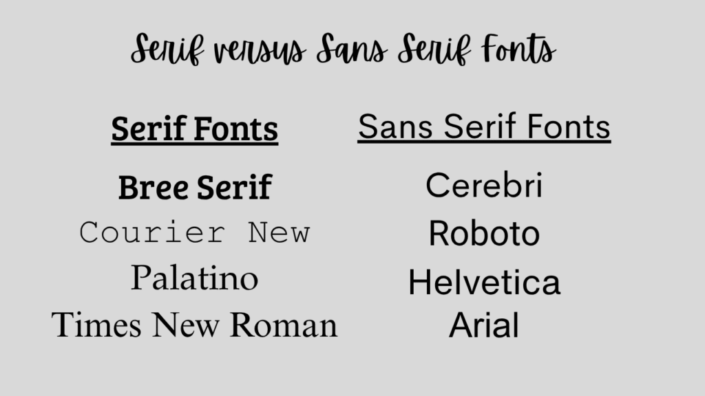
The font you choose should match your genre and tone. Here are a few quick ideas:
| Genre | Heading Font Idea |
|---|---|
| Romantic Comedy | Script or handwritten fonts |
| Fantasy | Elegant serif fonts or whimsical styles |
| Sci-Fi | Tech-inspired, minimalist fonts |
| Contemporary YA | Clean sans serif fonts |
| Horror | Gothic or sharp-edged serif fonts |
✍️ Pro Tip: A serif font has those little lines or feet on each letter (like a typewriter). A sans serif font is smoother and more modern (think Helvetica).

Most formatting tools like Vellum offer great options and a preview panel to test different looks. Just remember: be consistent throughout your book. No switching fonts halfway through!
Heading Placement and Layout
Once you’ve nailed down your font, you’ll need to decide how and where your headings live on the page:
- Centered or Left-Aligned?
Centered is classic and clean. Left-aligned can feel more modern and edgy. - Chapter Numbering Style
Do you want “Chapter One,” “1,” or something quirky like “Act I: The Fall”? You get to decide! - Chapter Titles or POV Labels?
If you’re writing a dual POV book (like Etta and Gina, which alternates perspectives), consider labeling chapters with the character’s name:
→ Chapter 3 – Etta
→ Chapter 4 – Gina
This helps your reader stay grounded, especially in romance or multi-character narratives.
Subheadings in Nonfiction? We Got You.
If you’re formatting nonfiction, subheadings are your best friend.
They:
- Make your book skimmable
- Guide the reader through complex ideas
- Break up long walls of text
Use a style hierarchy like:
- Heading 1: Chapter Title
- Heading 2: Main Topic
- Heading 3: Sub-topic
📋 Formatting Tip: Create a simple style sheet for yourself! Even if it’s just a Post-it or Notes app memo, jot down your font choices, heading sizes, and spacing. This will help keep things consistent—especially helpful if you’re formatting in Word or Google Docs.

Let’s Talk Flourishes (aka the Fun Stuff!)
Now for the sparkly part—flourishes! These are the visual decorations that make your print book stand out. Think of them as confetti sprinkled on the pages (just, you know, tastefully).
1. Scene Breaks
You know when your chapter has a time jump, POV switch, or location change? You don’t always need a full chapter break. Enter: the scene break!
Instead of using a boring row of asterisks, you can insert:
- A cute swirl design
- Stars ✨
- A custom Canva-made image (like a vine, a spiral, or a moon phase)
Formatting programs like Vellum usually offer several built-in options, or let you upload your own custom flourish. Just make sure your image is sized correctly (they’ll tell you the specs).
2. Chapter Openers
Another place for a flourish? The beginning of your chapters!
You can:
- Add a horizontal line or graphic under the chapter title
- Use large drop caps or stylized first letters (e.g., “The quick brown fox…”)
- Highlight the first few words in bold or caps for drama
Just keep in mind that some of these effects don’t always translate to eBooks. Flourishes are generally best appreciated in print format, so if you’re releasing both, test both layouts.
3. Text Messages in Modern Fiction
This one’s a little bonus tip! If your modern-day novel includes text messages, you’ve got some formatting choices to make.
You can:
- Format them like regular dialogue with “she texted” tags
- Use italics to differentiate them
- Create actual text message bubbles (some formatting tools allow this!)
- Use bold headers like:
SOPHIE: hey are you coming over or nah?
The goal? Clarity and consistency. Whatever style you choose, stick with it so your readers don’t get confused.

Keep It Professional—but Playful
Here’s your guiding principle with headings and flourishes: subtle flair, not visual chaos.
Sprinkles of style are delightful. A full cupcake shop explosion? Not so much.
If you use flourishes on every single page, it might distract from your story. Instead, treat them like spices in a recipe—just enough to enhance flavor, not overpower it.
Style Sheet Reminder 📝
Create a style sheet—even if you’re using pro software like Vellum or Atticus.
Include:
- Paragraph font
- Heading font
- Chapter heading alignment
- Subheading sizes
- Flourish choices (for scene breaks, chapter openers, etc.)
- Any design elements you plan to use in print or eBook versions
This is your visual blueprint, and it makes revisions and consistency so much easier.
Final Thoughts: Formatting Is Your Book’s Vibe Check
Formatting isn’t just about margins and line spacing—it’s part of your reader’s experience.
It gives your book visual personality. It helps communicate your genre and tone before your reader even dives into the prose. And it shows that you, the author, took the time to create a professional, enjoyable product.
Even if you’re not a “design” person, headings and flourishes let you express creativity beyond the words. And the best part? You get to decide what fits your book.
Free Formatting Checklist 🎁
If this all feels a little overwhelming, I’ve got your back. Grab my free formatting checklist—it walks you through everything from front matter to font choices to finishing touches like… yep, headings and flourishes.
👉 Download the Free Formatting Checklist Here

Got Questions? Let’s Chat!
Drop your formatting questions in the comments—or message me if you’re stuck on fonts, flourishes, or first-page freakouts. I might even turn your question into a full video or blog post!
Happy formatting, and even happier writing!
